Performance Metrics Software: A 2026 Guide to What Matters
Unlock your potential with the right performance metrics software. Our 2026 guide covers features, selection, and how to measure what truly matters.
You probably have some version of this open right now. A dashboard full of charts, a project tracker full of statuses, maybe a spreadsheet someone updates every Friday. Everything looks measurable. Very little feels clear.
That's a core problem with performance metrics software. Many teams don't suffer from a lack of data. They suffer from a lack of decisions. They can see server latency, ticket volume, campaign activity, sales calls, and hours logged, but they still can't answer the harder question: what should we do next?
I've seen this from both sides. In one world, performance means response time, throughput, reliability, and resource utilization. In the other, it means hitting goals, improving team execution, and helping individuals follow through. People often treat those as separate categories. They aren't. The same operating principle applies to both. Measure what matters, compare it against a baseline, and use it to make better decisions.
Table of Contents
- From Data Overload to Decisive Action
- What Is Performance Metrics Software
- Core Features That Turn Data into Decisions
- How to Choose the Right Performance Software in 2026
- Your Implementation and Adoption Playbook
- Real-World Dashboards and KPI Examples
- Beyond Traditional Tools Where Beyond Time Fits
From Data Overload to Decisive Action
A lot of software gets sold as a visibility solution. Visibility sounds useful, and it is, up to a point. But a team can become highly visible to itself and still stay stuck.
That happens when metrics live in isolation. Engineering has one dashboard in Datadog or Grafana. Sales has another in Salesforce. Operations exports data into Google Sheets. Individual contributors keep personal to-do lists in Notion or Todoist. Each tool reports activity. None of them reliably connect activity to outcomes.
The fix isn't “more data.” It's a tighter chain between signal, interpretation, and action.
The two worlds of performance
Traditional performance metrics software came from operational measurement. Teams needed to know whether systems were fast, stable, and capable under load. That's where metrics like response time, throughput, error rate, and resource utilization matter most.
Human and business performance uses the same logic with different objects. Instead of asking whether a server can handle demand, you ask whether a team is making progress against a goal. Instead of tracking CPU saturation, you track whether deadlines slip, habits break, or milestones stall.
Practical rule: If a metric can't change a meeting, a plan, or a person's next action, it's reporting. It's not management.
Why leaders get confused
The confusion usually starts when teams mix levels. They track low-level inputs and expect high-level clarity. For example:
- System teams watch latency graphs but don't define what threshold should trigger investigation.
- Managers track task completion but don't link tasks to a quarterly outcome.
- Individuals log hours but don't compare planned work to actual work.
That's why good performance metrics software has to do more than capture events. It has to help people choose what to pay attention to, what to ignore, and what to change next. The best tools reduce ambiguity. They don't just make prettier dashboards.
What Is Performance Metrics Software
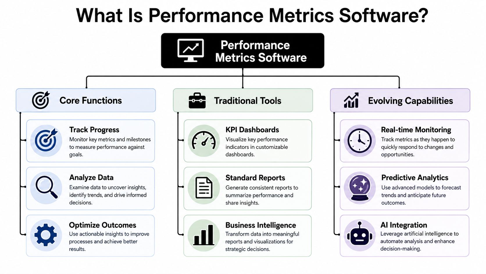
At its simplest, performance metrics software is any software that helps you measure progress against a defined standard. That standard might be technical performance, business performance, or personal goal performance.
Traditionally, people used the term for systems that monitored applications, infrastructure, and business KPIs. Over time, the category widened because teams stopped caring only about whether work was happening. They started caring about whether the work was creating the intended result.
Industry guidance from Harness on software development metrics describes that shift clearly. Performance measurement became more strategic as organizations moved from tracking project activity alone toward tracking software behavior, user experience, and business outcomes.
Two meanings that belong together
The old-school meaning is still valid. In technical environments, performance metrics software tracks things like:
- Response time: How long a system takes to answer
- Throughput: How much work the system completes
- Reliability and availability: Whether the service remains usable
- Serviceability: How maintainable and supportable it is
Performance-testing guidance also points to operational KPIs such as requests per second, time to first byte, thread counts, and scaling latency. Those are concrete signals that tell engineers whether a product can handle real use, not just test conditions.
The modern meaning is broader. It includes tools that help a founder track company goals, a manager track team execution, or an individual track habits and milestones. In that sense, a goal-tracking system can sit in the same family as an APM platform or KPI dashboard because the underlying job is the same: compare current performance to a baseline and make a better decision.
If you want a consumer-friendly example of that broader category, WeekBlast performance metrics is a useful reference point because it frames metrics in a way that's easier to connect to execution rather than pure reporting.
Think like a driver, not a dashboard collector
A car dashboard is a better analogy than most software definitions. You don't look at fuel, speed, engine temperature, and route position because numbers are interesting. You look at them because they help you arrive safely and on time.
Good performance metrics software works the same way.
A useful metric answers one of three questions. Are we healthy, are we progressing, or are we off course?
Here's a practical framework:
| Layer | What it measures | Example |
|---|---|---|
| System health | Whether the machine is working | Response time, error rate |
| Operational flow | Whether work moves smoothly | Throughput, backlog movement |
| Outcome progress | Whether the goal is getting closer | Milestone completion, goal attainment |
Trouble starts when teams stay on the first layer and assume the third will take care of itself. It won't. Software can tell you a service is stable. It can't assume what business result that stability should support. Someone still has to define the objective.
Core Features That Turn Data into Decisions
A feature list only matters if it changes behavior. That's the standard I use when I evaluate performance metrics software. If a feature doesn't help a person notice something important, decide faster, or follow through better, it's decoration.
Collection is the easy part
Most tools can collect data. The hard part is collecting the right data with the right level of discipline.
A practical setup usually includes five parts:
- Data collection: Telemetry, events, logs, task updates, time entries, or CRM activity enter the system.
- Dashboards and visualization: These give people a quick read on status, trends, and anomalies.
- KPI tracking: This connects raw data to defined targets.
- Alerts and notifications: These surface exceptions before a weekly review catches them too late.
- Integrations: These let the metric system pull from the tools where work already happens.
Business performance guidance says effective KPI programs typically focus on 5-7 KPIs, with monthly reporting as a common cadence for adjustment and accountability, according to Risk Inc's overview of KPI practice. That matters because software becomes noisy fast when every possible metric gets promoted to a top-line signal.
Good software creates accountability loops
The best dashboard in the world won't help if nobody knows what to do when a metric moves.
That's where feature quality matters more than feature count.
Consider a few examples:
- A dashboard should show trend lines against a baseline, not just current numbers.
- An alert should tell someone what changed and who owns the response.
- An integration should reduce manual entry, not create a second place to update work.
- A KPI view should map directly to a team objective or personal goal.
If you're evaluating tools that connect effort to output, it helps to understand how raw work data gets captured in the first place. This walkthrough of time tracking in practical workflows is useful because time data often becomes the bridge between intention and actual execution.
What each feature is really for
Here's the no-nonsense version:
| Feature | What buyers think it does | What it should actually do |
|---|---|---|
| Data collection | Gather everything | Filter for decision-relevant signals |
| Dashboard | Display activity | Highlight movement against goals |
| KPI tracking | Count things | Hold teams accountable to outcomes |
| Alerts | Notify users | Trigger timely intervention |
| Integrations | Sync tools | Keep context connected |
Don't reward a tool for showing you more. Reward it for making the next action obvious.
That's the difference between a reporting system and a management system.
How to Choose the Right Performance Software in 2026
Choosing performance metrics software gets easier when you stop shopping by category. “Analytics,” “productivity,” “BI,” and “monitoring” are vendor labels. They don't tell you whether the tool matches your problem.
Start with the job you need done. Are you trying to improve software reliability? Align a team around a small set of goals? Help individuals execute consistently? Those aren't the same buying decisions, even if the interfaces look similar.
Start with the job, not the tool category
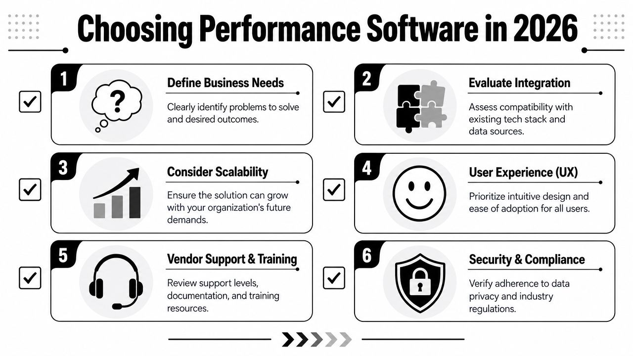
Most buyers should test against five criteria:
- Scalability: Can the software handle more users, more data sources, and more complexity without becoming painful?
- Integration fit: Does it connect cleanly to tools like Jira, Linear, GitHub, HubSpot, Salesforce, Slack, or Google Workspace?
- Security and access control: Can you restrict who sees what, especially across managers, contributors, and departments?
- Analytics depth: Can the tool move beyond charts into trends, comparisons, and root-cause questions?
- Total cost of ownership: Subscription price matters, but so do setup time, training burden, and ongoing admin work.
A lot of teams also need product analytics or user guidance in the mix. If that's part of your stack review, this guide to Pendo alternatives for SaaS can help you compare adjacent options without treating every analytics tool as interchangeable.
Video can also help when you're shortlisting vendors and trying to separate polished demos from real capability:
Software selection priorities by persona
Different buyers should weight those criteria differently.
Software Selection Priorities by Persona
| Criterion | Solo Founder | Team Manager | Enterprise Dept. |
|---|---|---|---|
| Primary concern | Simplicity and fast setup | Team visibility and accountability | Governance and scale |
| Integration priority | Calendar, task, CRM basics | Project tools, communication tools | Broad stack coverage and admin controls |
| Analytics need | Clear progress views | Team trends and bottlenecks | Cross-system reporting |
| Security need | Basic but solid | Role-based visibility | Strong controls and compliance review |
| Cost sensitivity | Very high | Moderate | Balanced against operational risk |
If you're comparing team-oriented tools specifically, this overview of productivity tracking software options gives a helpful lens for separating surveillance-style tracking from outcome-oriented systems.
Questions worth asking in a live demo
A vendor demo gets useful when you ask operational questions instead of generic ones.
- “Show me how a metric becomes an action.” If the answer stays in dashboard land, that's a warning.
- “What does setup look like for our first useful report?” You want speed to first value.
- “How do you prevent metric overload?” Good products have opinionated ways to focus attention.
- “What breaks when our process changes?” Rigid systems age badly.
- “Who on our team will have to maintain this?” Hidden admin burden kills adoption.
A good buying process feels less like selecting software and more like choosing a measurement philosophy. The right tool reflects how your team thinks about performance.
Your Implementation and Adoption Playbook
Most performance software rollouts fail for a boring reason. The team installs a tool before agreeing on what decision it should improve.
That's backwards. Implementation should start with a management problem, not a software project. The tool only matters after the team knows what it needs to notice sooner, discuss more clearly, or correct faster.
Begin with one decision that needs to improve
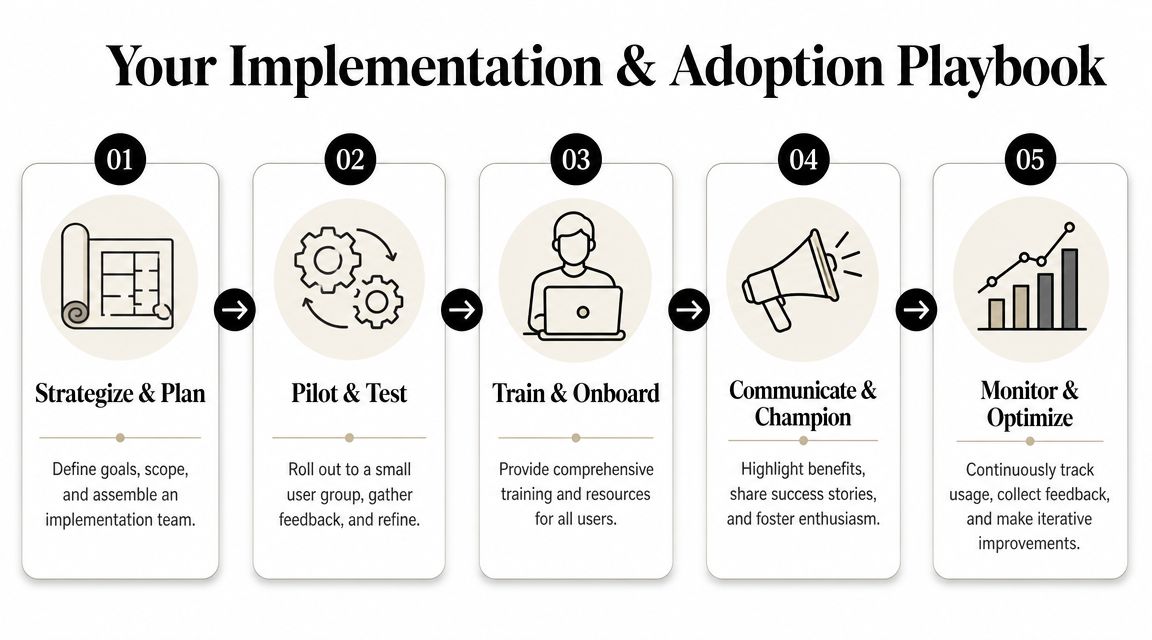
A clean rollout usually looks like this:
- Define the objective. Pick one outcome that matters. Reduce missed deadlines. Improve release stability. Increase consistency in planned work.
- Choose a pilot group. Start with a team that has a real need and a manager willing to review the data.
- Build the smallest useful dashboard. Not the most complete one. The one that answers the pilot team's operating questions.
- Set a review rhythm. Weekly works for execution. Monthly works for KPI adjustment and accountability.
- Tune based on behavior. If nobody acts on a metric, remove it or reframe it.
This sounds simple because it is. Teams make it hard by trying to model the entire business on day one.
Avoid the two rollout failures teams create themselves
The first failure is the vanity dashboard. It looks impressive, shows lots of activity, and changes nothing. The second is metric gaming. People learn what the score rewards and start optimizing the score instead of the outcome.
Platform engineering guidance warns about exactly this problem. Teams can optimize for metrics rather than outcomes, and if a metric doesn't map to a concrete action, it can create false confidence rather than improvement, as noted by the Platform Engineering guidance on metrics that matter.
If people can raise the number without improving the result, you picked the wrong metric or attached it to the wrong incentive.
A few adoption rules help:
- Name an owner for each KPI. Shared metrics with no owner usually drift.
- Tie every metric to a review conversation. If no meeting uses it, it won't matter.
- Keep definitions stable. Changing formulas every week destroys trust.
- Explain intent clearly. Teams adopt measurement faster when they know it's for improvement, not punishment.
The human side matters most. People don't resist measurement because they hate data. They resist systems that feel arbitrary, disconnected, or unfair.
Real-World Dashboards and KPI Examples
Abstract advice only goes so far. A dashboard becomes useful when it reflects the actual job of the person looking at it.
Founder dashboard
A founder doesn't need twenty charts every morning. They need a short operating view that helps them decide where to focus.
A practical founder dashboard might include:
- Revenue progress against target: Not just total revenue, but movement toward the current goal.
- Pipeline health: Whether future revenue has enough support behind it.
- Product reliability signal: A small set of health indicators so customer pain doesn't stay hidden.
- Planned versus completed strategic work: Because founders often confuse busyness with progress.
If you want inspiration for the sales side of that picture, these powerful sales dashboards are a useful reference for how commercial metrics can be organized around action rather than clutter.
Team manager dashboard
Managers need a different view. They're usually trying to spot execution risk early.
Their dashboard often works best with metrics like:
| Metric | Why it matters |
|---|---|
| Milestone status | Shows whether commitments are slipping |
| Cycle bottlenecks | Reveals where work gets stuck |
| Bug or issue aging | Surfaces neglected quality problems |
| Team capacity versus commitment | Prevents chronic overplanning |
Many teams benefit from a more grounded approach to productivity measurement, especially when they want to assess progress without reducing people to simplistic activity counts.
Student and creator dashboards
For individuals, performance metrics software should feel personal, not corporate.
A student dashboard might track study sessions completed, assignment progress, and practice score trends against a planned schedule. A creator dashboard might track content published, content pipeline status, audience engagement quality, and whether monetization work gets done.
The best personal dashboards answer one uncomfortable question each day: did I do the work that mattered, or did I stay busy around it?
That's why personal metrics often work better when they compare intention with follow-through. They create honesty, which is usually more valuable than complexity.
Beyond Traditional Tools Where Beyond Time Fits
Traditional tools do a solid job at telling you what happened. BI platforms, APM systems, and KPI dashboards can show trends, anomalies, and operational status. They're often weaker at telling an individual or a small team how to execute differently tomorrow.
That gap matters because most outcomes are created below the dashboard level. A quarterly objective gets hit because someone planned the right milestone, protected the right block of time, and repeated the right behavior often enough.

Where classic tools stop short
Tools like Tableau, Power BI, Grafana, Datadog, Mixpanel, and Jira are useful in their own lane. They help teams observe systems, visualize business data, and coordinate work.
But many people still end up with a fragmented personal execution stack:
- Goals in a document
- Tasks in a task app
- Habits in a habit tracker
- Time in a timer
- Reviews in a spreadsheet
That fragmentation is where momentum gets lost. The measurement exists, but the loop between goal, plan, action, and review stays broken.
Where Beyond Time fits
Tribble Software Private Limited approaches that problem as an AI-powered goal achievement system. It uses an OKR-based model to turn objectives into sequenced milestones, ties them to routines and habits, and adds planned-versus-actual tracking in its iOS app. For a founder, student, or small team lead, that makes it less like a classic BI dashboard and more like execution software with measurement built in.
That makes it complementary to traditional performance metrics software in companies. A business can still use Power BI for departmental reporting or Datadog for infrastructure health. A person or small team can use Beyond Time to connect those larger objectives to daily behavior, milestone completion, and personal accountability.
That's the bigger point of this whole category. Whether you're measuring server latency or study consistency, the principles don't change. Start with the outcome. Choose a small number of meaningful metrics. Review them on a real cadence. Use them to decide what changes next.
Keep going with Beyond Time
These Beyond Time resources help you close the gap between a dashboard full of data and work that actually moves forward.
- Smart Goal Validator — Check that every objective you track is actually measurable.
- Goal Prioritization Matrix — Focus your metrics on the outcomes that matter most.
- Beyond Time vs Notion for Goal Tracking — See when a connected execution system beats a flexible doc.
- Best Goal Tracking Apps 2026 Compared — Find the tool that turns your metrics into follow-through.
If you want a system that connects goals, milestones, habits, and daily execution in one place, take a look at Tribble Software Private Limited. It's built for people who don't need another passive dashboard. They need a tighter loop between planning, tracking, and getting the work done.
Put this into practice
Free tools that match this article.
Goal Setting Worksheet
Turn a vague goal into milestones, habits, blockers, and a weekly review plan.
Try Goal WorksheetTime ManagementWeekly Schedule Template
Plan your week with a free printable weekly schedule template for goals, routines, and focus blocks.
Try Schedule TemplateTime ManagementTime Blocking Template
Map your day into focused time blocks with a free printable time blocking template.
Try Time BlockingGoal SettingSMART Goal Validator
Instantly validate your goals against the SMART framework and get actionable improvement suggestions.
Try SMART ValidatorKeep exploring this topic
Goal setting guide
Start with the fundamentals of setting goals that turn into action.
Time blocking guide
Turn priorities into protected calendar blocks.
Goal frameworks compared
Choose between SMART goals, OKRs, BHAGs, and 12-week goals.
15-minute time blocks
Plan and review your day with more realistic precision.
Related Articles
10 Actionable Affirmations for Success in 2026
Unlock your potential with these 10 powerful affirmations for success. Learn how to integrate them into your goal-setting workflow for radical accountability.
Productivity Tracking Software: Your Complete 2026 Guide
Discover what productivity tracking software is, how to choose the right tool, and how to use it to achieve real goals. A complete guide for 2026.
AI Accountability Partner: Smarter Goal Setting
Tired of missed goals? An AI accountability partner provides the structure & feedback you need. Explore benefits, workflows, and tools.
The Force of Habit: Master Your Autopilot for Success
Learn what the force of habit is and how to use its power. This guide explains the neuroscience and gives you evidence-based strategies to build good habits.
How to Be Efficient and Productive: A 2026 System
Stop being busy and start being efficient and productive. Learn a practical, AI-enhanced system to set goals, track progress, and build unstoppable momentum.
8 Peer Feedback Examples: Drive Growth in 2026
Discover 8 peer feedback examples for positive, corrective, & developmental conversations. Drive results & build momentum with effective feedback in 2026.